We launched a new logo, and starting to refresh our look. We loved our old logo, and there are many who felt the same. And yet, here we are to explain why we decided to evolve it.
Making a change
Firstly, its not a change for the sake of change. That said, change is inevitable, and something to be embraced. A good reason to change a logo is that its not doing the job you want it to do.
Our first logo was created before the company had launched. It was descriptive and clear and the building with the communication bubbles represented exactly what we were “building communication.”
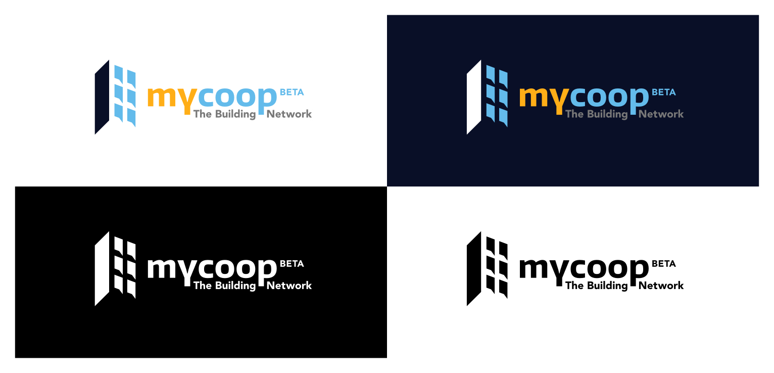
Secondly, It was also extremely boring and predictable. It was an image of a building, every real estate company has an image of a building in their logo and quite frankly, we are not exactly a real estate company.
Thirdly, the playfulness of our name wasn’t visible, I mean we are “mycoop” we are about cooperation, sharing, enjoyment, locations, homes and birds….yes, we love birds. See our post about the meaning behind the name.
What’s next
We won’t bore you with the design thinking and the thought behind our font choices- you’re busy people, and our main intention for this post was to let you know about the change, so you won’t be too surprised when the icons on your phone/laptop/tablet look a little different.
Over the next few months, you’ll see all the other visuals around mycoop aligning around this new direction: on the website, and in some place in the product (though not in a way that will keep you from the important business of managing your building, of course). We of course are still a startup, so no billboards and hats and t-shirts but if you really want some for your building you can always ask.
Love where you live, the team from mycoop